Communications Manager
1 Understanding The User
User Concerns
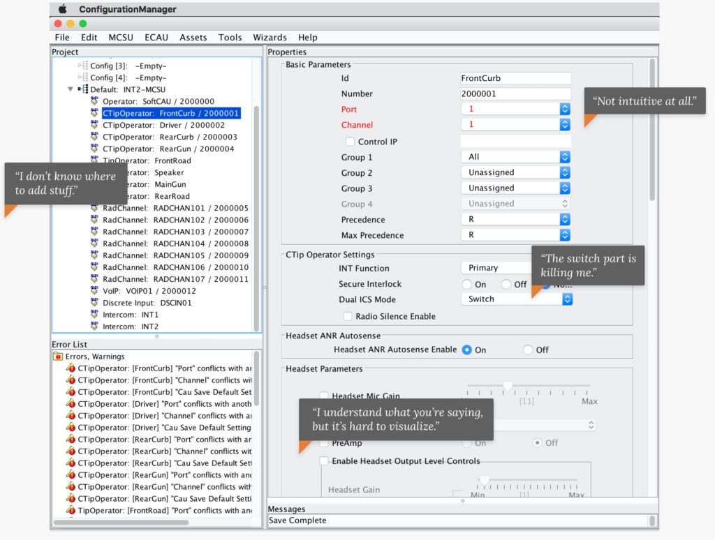
- Inconsistent naming conventions. This contributed to high levels of confusion and cognitive overload; errors were common.
- Wayfinding and discoverability. The inability to locate necessary items in the midst of complicated workflows contributed to errors and frustration.
- Heavy training requirements. Legacy users with significant experience could navigate the system - but new or inexperienced operators were encumbered with heavy training requirements that took a long time to learn.
- Lack of error recovery. The system didn’t provide for easy identification or resolution of errors - and many went unaddressed.
2 Guiding Principles
- Inconsistent naming conventions. This contributed to high levels of confusion and cognitive overload; errors were common.
- Wayfinding and discoverability. The inability to locate necessary items in the midst of complicated workflows contributed to errors and frustration.
- Heavy training requirements. Legacy users with significant experience could navigate the system--but new or inexperienced operators were encumbered with heavy training requirements that took a long time to learn.
- Lack of error recovery. The system didn’t provide for easy identification or resolution of errors -- and many went unaddressed.
3 Inspiration

Research
Nielsen’s 10 Usability Heuristics for User Interface Design: To better understand the nuances of the system, our research team received a week of training on how to use the system in addition to conducting observations on user training and testing. Following this, a heuristic evaluation was conducted to identify usability issues in the legacy system and guide discovery research activities.
Heuristic evaluations are a quick and structured approach to review a design against a set of usability standards. In this case, we modified Nielsen’s 10 Usability Heuristics for User Interface Design to fit our goals.
Once high-level pain-points were identified, a variety of discovery activities (interviews, affinity diagramming, card sorts, and cognitive walk-throughs) were conducted with each individual user group to explore user needs and use cases for the primary workflows and key system features.

Tools
Adobe Creative Cloud: Tools can make or break the design process. And not only design, but the documentation and sharing of designs across teams are also impacted. For our purposes, we relied heavily on the wide range of tools in Adobe Creative Cloud – which also offers secure services for sensitive domains.
In our project, we primarily used Adobe Illustrator for the actual product design and Adobe XD for documentation, sharing and feedback. Although XD is built for a certain amount of design, we relied on Adobe Illustrator to do the heavy lifting for drawing hubs, nodes, and network icons.
Adobe XD greatly reduced documentation and sharing of the designs – with great automated features in the developer and designer modes that allowed us to bypass the manual creation of specs for colors, fonts, and sizes – which XD provides automatically.

Color
Interaction of Color by Josef Albers: The introduction of color into an otherwise mostly gray palette of the previous tool was critical to creating a more inviting user experience – and getting the right contrast levels and color harmony was important. Colors needed to work well within a general office lighting environment. And some users preferred a dark palette – our solution was to design for general office lighting along with a night theme to ensure wide adoption of the tool.
In our design process we found lots of inspiration and color theory information based on the work of Josef Albers Interaction of Color – one of the most influential books on color ever written. The app, based on this book, was a great tool for understanding color theory, trying color experiments, and sharing color combinations.
4 Designing For Simplicity
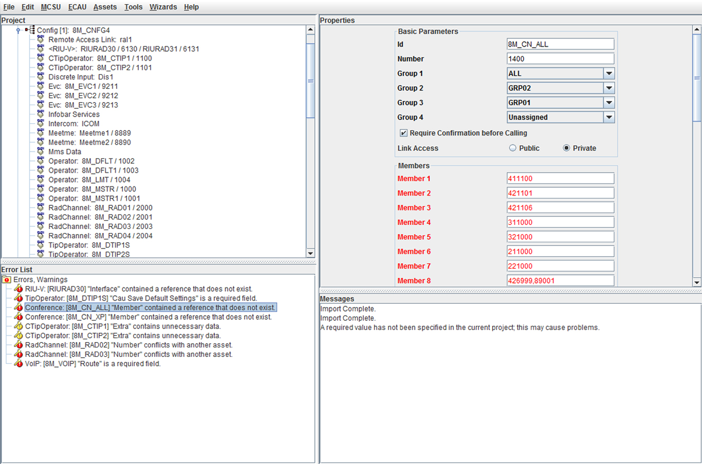
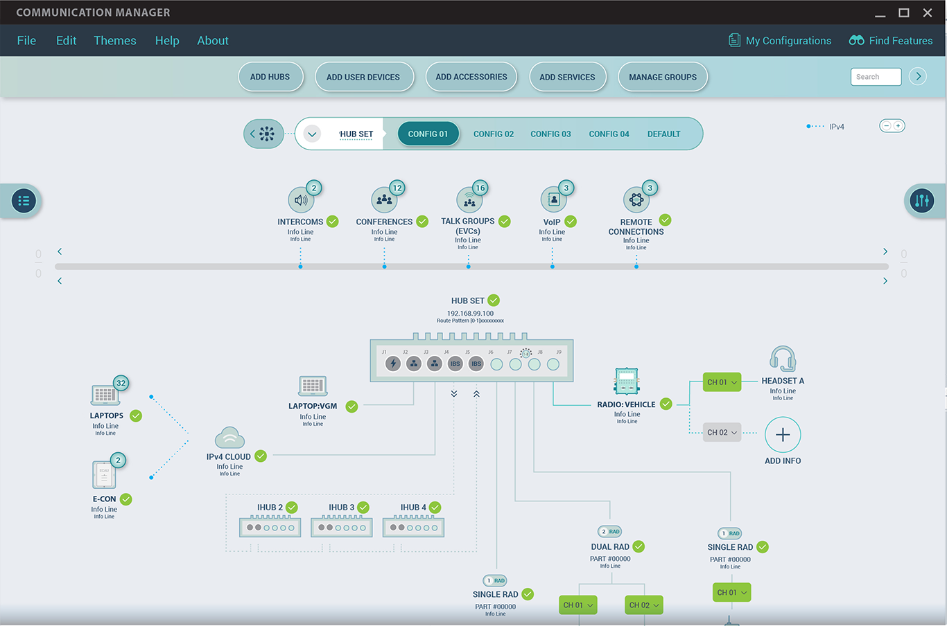
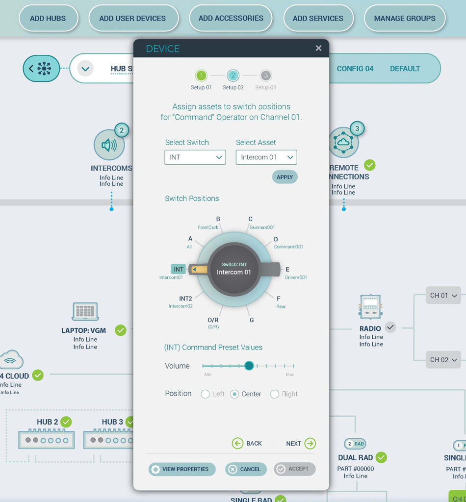
Our goal for this product was to design for simplicity – so that even new users could easily understand and use the product. Primary pain points of the legacy product centered around complicated or poor heuristics, lack of intuitive work-flow, and confusing terminology – ultimately creating a product that was complicated to use and mostly functional for experienced legacy users. Of key concern was that users were unable to quickly visualize relational connections between devices and networks. By designing to common visual diagramming mental models, the user experience was greatly simplified and cognitive loads were reduced – and new users could more easily adopt.
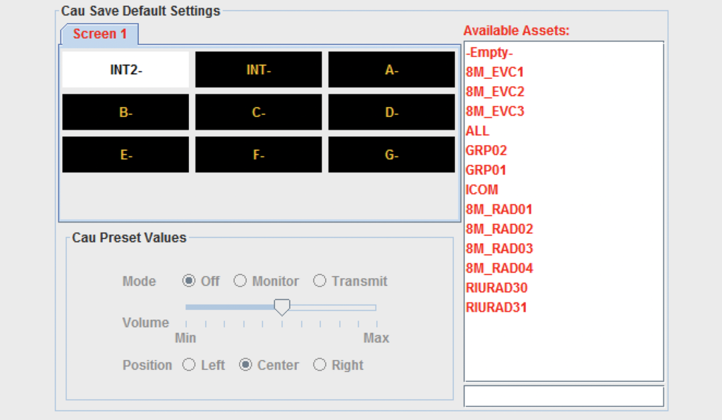
The screens below show a few examples from the legacy product through iteration and completion:
Before
Iterating
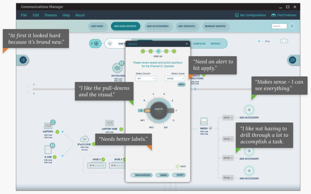
After
Simplifying Common Task Flows
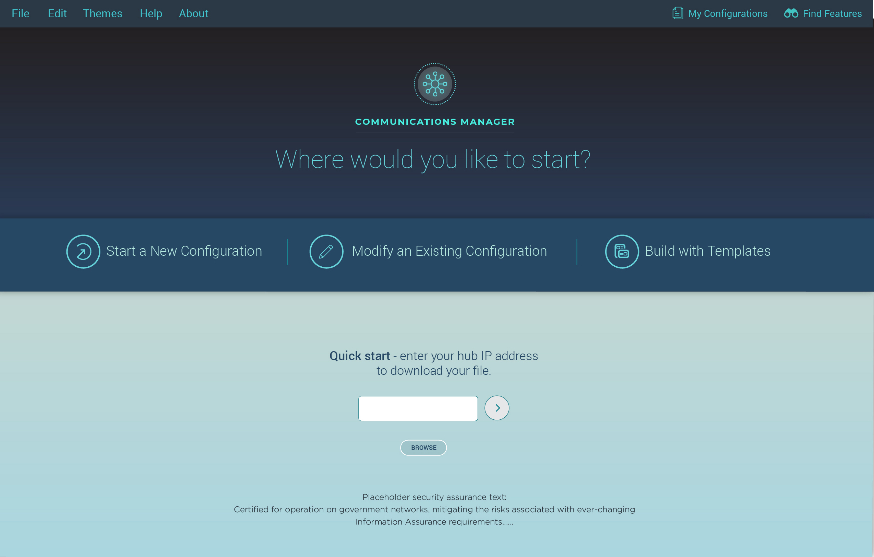

Start or new configuration. When tested, most new users didn’t now how to begin or complete a new configuration in the legacy system. Although a wizard was available, many skipped this due to usability problems. The redesign made this a clear path directly from the home page - and was key for new users.

Quick start. The majority of users for this product mostly needed to modify an existing communication configuration. To facilitate speedy access, users could enter their IP address directly from the home page to begin this work flow.

Build with templates. Based on user research, it was found that many users desired a faster way to create a communication configuration; templates based on common configurations were added as a new capability to support this desired user feature.
5 Lessons Learned
- Allow legacy knowledge to inform the experience, but always consider the new user when designing a product – make it easy to adopt and simple to use.
- Avoid complicated terminology wherever possible.
- Incorporate common mental models to support easier user adoption.

